Marine Corps recruiting offices across the country may soon be getting a major face-lift for the first time in more than 17 years as the service continues to make attracting young Americans a top priority.
In late September, the service published a sources-sought solicitation for a “branding refresh” that would apply to the more than 700 Marine Corps recruiting stations, officer selection stations and recruiting sub-stations.
The document states that the Marine Corps is “anticipating a requirement” to incorporate relatively recent brand updates into office interior design and external window dressing and display. The last such effort to standardize the look of recruiting offices began in 2006, it adds.
“Each facility is, essentially, the office and ‘storefront’ for Marine Recruiters to conduct their day-to-day business, meet recruits and their parents, and project a professional and consistent brand appearance to the communities in which they’re stationed,” the solicitation explains. “As office spaces are not uniform in their size, square footage, floorplan, etc., the branded retail experience served as a guide on how each facility could incorporate the core principles of the design to effectively achieve a consistent look and operational workflow.”
RELATED
The proposed update, according to documents, not only will incorporate brand updates, but also optimize the use of interior space “in accordance with best industry practices.”
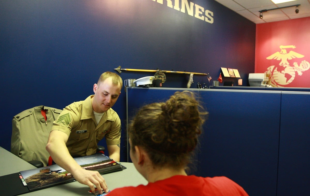
Marine Corps recruiting stations ― often found in high-traffic commercial areas such as strip malls ― typically feature a glass storefront featuring the iconic eagle, globe and anchor insignia on a dark background and the slogan “Marines: The Few, The Proud.”
Office interiors typically are color-blocked, with adjoining walls painted in Navy blue, tan and crimson: the colors featured on the Marine Corps dress uniform. Furniture is dark and spare and common spaces feature ceiling overhead lights. While uncluttered, the look seems dated and the combined effect can be harsh.
Brand management company Landor Associates described designing this scheme in a 2018 blog post that outlined the challenges and goal of standardizing what had been until then a disjointed aesthetic. In particular, the post said, Marine Corps recruiting substations, which are part of larger multiservice recruiting centers, were “undifferentiated” from the other branches. Following a prototype rebrand, “locations experienced a significant improvement in recruiting traffic and staff response was overwhelmingly positive,” the post stated. “Its success led to the approval of a nationwide implementation of the program over several years.”
While many decisions have yet to be made, Marine Corps Recruiting Command has already begun introducing more “red-dominant” color schemes into recruiting centers, command spokeswoman Master Sgt. Rebekka Heite told Marine Corps Times in emailed responses to queries.
“Similarly to how the ‘Dress Blue’ uniform is instantly recognizable, we feel that the bold red look will help drive increased recognition of the Marine Corps brand and help differentiate us from the other services,” she said.
Heite said that no decision has been made on the timing of a new reband effort, or whether it will definitely take place.
The solicitation, she said, was intended to get a better understanding of the market for such work and what it would cost to execute. If a decision to rebrand is made, she said, offices would likely be remodeled during natural maintenance cycles or during already-planned relocations rather than according to a hard rollout schedule.
The prospective rebrand, she said, is a minor update that would allow centers to align “with the evolutionary changes that have happened in our presentation since offices were initially built out over 15 years ago. ... How we present existing elements will be the brand refresh.”
As with the previous rebrand, though, appealing to prospective recruits and differentiating the service will be a top goal. Any effort the service rolls out on, Heite said, “will help prospective recruits be able to tell at a glance that they are in a Marine Corps Recruiting Office as our branch is the only one that utilizes red in the primary colors.”
The Atlanta-based Wunderman Thompson, formerly J. Walter Thompson, has been the Marine Corps’ marketing and advertising agency for more than 75 years.
It’s behind the service’s most iconic recruiting efforts, including the 1990s-era TV ad featuring a Marine fighting a lava monster and the even more legendary “We Don’t Promise You a Rose Garden” recruiting poster. The agency, according to the solicitation, would work with contractors on any rebranding efforts.
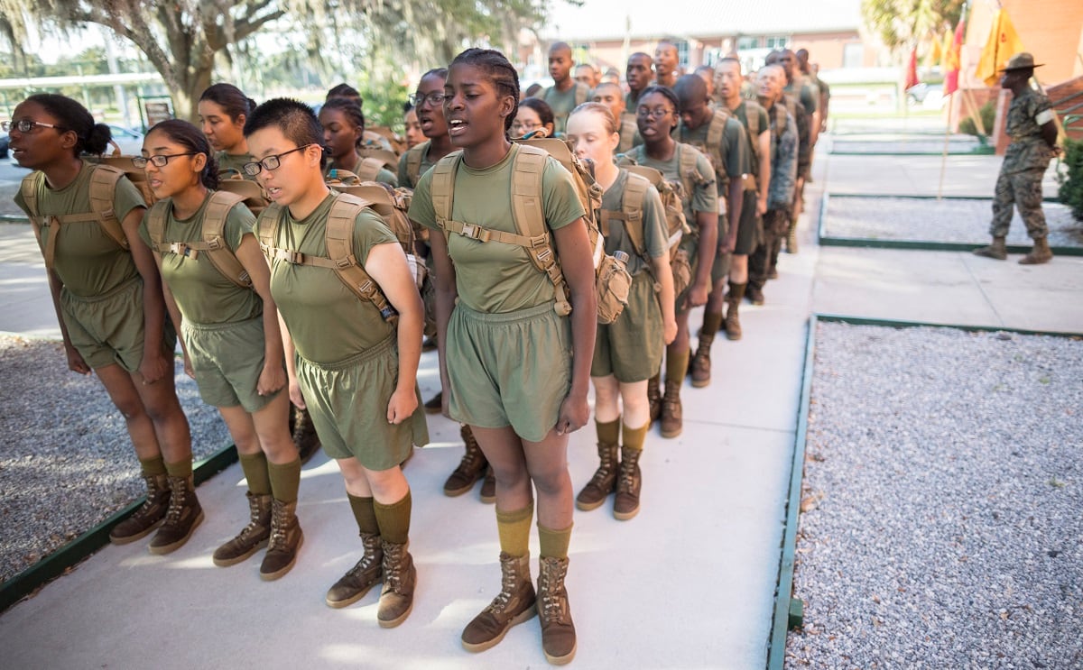
As all the military services face historic difficulties in meeting recruiting goals, the Marine Corps so has far fared the best.
It made its annual recruiting goal with fewer than two dozen recruits to spare. Leaders have emphasized the service’s strong identity as a major selling point, with now-Commandant Gen. Eric Smith offering a take on the rose garden slogan in February when discussing enlistment bonuses and other enticements.
“You get to call yourself a Marine,” he said. “That’s your bonus.”
Hope Hodge Seck is an award-winning investigative and enterprise reporter covering the U.S. military and national defense. The former managing editor of Military.com, her work has also appeared in the Washington Post, Politico Magazine, USA Today and Popular Mechanics.